Output - tables and graphics
Quantlab is designed for both the developer and the end-user of the analytics. To display analytics in a pedagogic yet comprehensive way, Quantlab have three different “display objects” to choose from. The expressions can be displayed in a graphical window and/or in a table. There are two table types, a general-purpose table where any scalar, vector or matrix can be displayed and a special-purpose table for instrument display.
General purpose table
A general-purpose table can be created on the menu Insert | Table or by pressing Ctrl T. This table type will display any scalar, vector or matrix expression. Multiple expressions can be attached to the table.
Attaching an expression to a table
Let’s look at a simple example. Open a new workspace by the menu File | New workspace and insert an expression window by the menu Insert | Expression. Then type the following:
// Example expression to paste in a general table

out series<number>(number) my_expr(number n) = series(i : 0, 10; i * i);
Compile this expression in the Editor using the menu File | Compile, or press F7. If you have the workspace browser open (View | Workspace browser) then you will see a + sign to the left of the Expression window. Click the + sign and you will see the symbol for the function my_expr. Now, insert a table using the menu Insert | Table. Drag the expression my_expr from the workspace browser (pressing the left mouse button) and drop it on the table.
The result should now look something like this.
You can now see the attached expression “my_expr - 1” in the workspace browser by clicking the + sign to the left of the table symbol. The number behind the expression name will help in keeping track of which instance of the expression you are working with.
The table will now display an input box for the user to input a value for the parameter n. A table will recalculate when the return key is pressed, or by pressing the “Recalc” button. If the table includes any real time data in the expression the table will update on any changed data.
When attaching expressions to tables or graphs Quantlab always creates auto-generated controls which correspond to the types of the parameters. If you want several parameters to be determined by the same control you can use the Parameters Options dialog, as described in Creating common controls using Parameters Options.
Table options and formatting
Parameter canvas Clicking on the close x, in the upper right hand corner, hides the parameter canvas displayed in the table. The same function will show by right clicking on the canvas and using the menu choice Hide Parameters.
Formatting the table By right clicking on the header a number of formatting options are available:
Format Attachment | Color and border |
Change colour settings and border style |
Format Attachment | Font |
Change font size and style |
Format Attachment | Number |
Change the number formatting of the selected column |
Format Attachment | Text alignment |
Change the horizontal alignment of any text in the cells |
Auto format |
Let the font be dependent on the value in the cell (only for numerical attachments). See Automatic text formatting. |
Column order |
Change order of presentation when multiple functions are used |
Minimal frames |
Will display table with minimal frame |
Display name |
Change the header name of the column. Dynamic header variables reflecting the current parameter setting can be inserted by double-clicking on the parameter. |
Rename table |
Change the name of the table |
Holiday |
Set a holiday calendar for the table. For expressions having date ranges the relevant holidays will be suppressed in the table. |
Hide/showparameters |
Switch the parameter view on and off |
Duplicate |
Will make a copy of the table. |
By right clicking on a specific cell, or multiple selections of cells, the same formatting options are available by choosing Format Cell. Cell(s) are available for formatting when the selection turns black.
Changing attachment order The attachment order can also be changed using drag and drop of columns. Put the curser on a column header, press Ctrl and use the left mouse-button to drag the column to the desired location.
Merging parameters The parameters that are needed in order to evaluate functions attached to tables can be merged to common controls. This is done in the same way as for graphs, see An example of how to merge parameters to common controls.
Transposing the table The table can be transposed so that columns and rows change places. Right click on the table and choose Transpose.
Vector parameters in general tables
When several input values of the same type are needed for a calculation it is convenient to use a vector parameter. When attaching an expression containing one or several vector parameters they will show up within the table. By clicking the right mouse-button on the column head it is possible to set or change the number of rows in the vector, by choosing “Input parameters|Set rows”. If you know that all input vectors will be of the same length, you may use the choice “Set entire row”. Note that sometimes it may be necessary to check the size of the input vectors in the code.
Vector parameters can be merged within a table as other parameters. They appear in the Parameters options dialog in a separate attachment symbol.
For some examples of how to use input parameters, see the case studies in Extending spread calculations with user input: bench_spreads2.qlw and Calculating covariances: covariance_matrix.qlw.
Automatic text formatting
In financial applications it is often useful to format the text (or numbers) in a table depending on the values shown, or other parameters. By right-clicking the column header of an attachment you can choose Autoformat. This gives the possibility to set up simple rules that changes the font and/or background colour depending on the number in each cell.
For more complicated situations there is a possibility to set the font and background colour from the code. The background colour can also be transient in order to flag for a change. For this purpose we have created the object text_rgb that can be attached to a table. This object is created by calling the function with the same name:
text_rgb(text, [fg], [bg], [transient_bg])
where text is the text as a string, fg is the font (foreground) colour, bg is the backround colour and transient_bg is a logical parameter that makes the background colour transient if true. The colours are given as RGB-triplets and can easily be defined using the function rgb(), for example:
rgb(255,0,0) (Red)
rgb(0,255,0) (Green)
rgb(0,0,255) (Blue)
rgb(0,0,0) (Black)
For an extensive example of the use of auto-formatting, see A condensed market page: market_page.qlw.
The instrument table
Instrument tables are possible to use in Quantlab 3.0 but are not recommended as the effect of an instrument table can be obtained through an ordinary table.
The instrument table is specially created for displaying lists of instruments and other input/output that refers to these instruments. The instrument table is itself defined by a vector of instruments and a date for which any evaluation should be done. Any function or method that can be used on an instrument can then be displayed in the table. The user can for certain settings change the instrument vector and evaluation date. There is also the possibility to define the instrument vector through a function, see below.
A standard instrument table
We will describe the standard instrument table using an example: We want to display a list of bonds and their current prices and durations.
Insert a new instrument table from the menu Insert | Instrument table.A “wizard” will ask for which date and which instruments to initially display. Here is shown the left side of this dialog.
In the date option, only the parameter choice will give the user of the table a possibility to change the date again. The other two options will fix the date for the table permanently.
Either you can let the quote side be a parameter for the user to change, or you can use the fix value (which is defaulted to the value under Tools Options.
If your Quantlab already is prepared with curves, choosing a complete curve is obviously convenient. If not, instruments can be chosen from the list of available instruments.
Tip
If you have no curves defined in your Quantlab database, it is easily done from the Database tool that was shipped with your Quantlab installation. See separate manual for further instructions.
The table is now created with your initial choice of date and instrument selection. User controls have also been added to the table. Next step will be to add our needed information about the instruments chosen.
Now to some simple programming [1]: We will need to create an expression having three instrument methods in order to get the name, price, and duration. For more functions see the function index.
// Example of some functions that apply for instruments

out vector(instrument_name) Name (vector (instrument) i) = i.name();

out vector(number) Dirty_price (vector (instrument) i) = i.dirty_price();

out vector(number) Duration (vector (instrument) i) = i.mac_dur();
Note
Any code written to display functions in an instrument table must have the vector of instrument as the last argument.
Compile (press F7) and confirm that the expressions appear in the workspace browser. Now it is simple to drag-and-drop the instrument information to the instrument table. The result should look something like in the following picture.
Example of an instrument table with three columns (showing Swedish government bonds)
One of the special features of the instrument table is that it will automatically evaluate any expression over all the instruments in the chosen vector. A general-purpose table cannot do this.
Formatting the instrument table
By right clicking on the header a number of formatting options are available:
Sort |
Will sort the table according to the chosen column |
Format Attachment | Color and border |
Change colour settings and border style |
Format Attachment | Font |
Change font size and style |
Format Attachment | Number |
Change the number formatting of the selected column |
Format Attachment | Text alignment |
Change the horizontal alignment of any text in the cells |
Auto format |
Let the font be dependent on the value in the cell (only for numerical attachments) |
Column order |
Change order of presentation when multiple functions are used |
Minimal frames |
Will display table with minimal frame |
Display name |
Change the header name of the column. Dynamic header variables reflecting the current parameter setting can be inserted by double-clicking on the parameter. |
Rename table |
Change the name of the table |
Holiday |
Set a holiday calendar for the table. For expressions having date ranges the relevant holidays will be suppressed in the table. |
Hide/show parameters |
Switch the parameter view on and off |
Duplicate |
Will make a copy of the table. |
By right clicking on a specific cell, or multiple selections of cells, the corresponding formatting options are available by choosing Format Cell. You can select multiple columns or cells by using the left mouse button. Cells or column headers are available for formatting when the selection turns black.
The attachment order can also be changed using drag and drop of columns. Put the curser on a column header, press Ctrl and use the left mouse-button to drag the column to the desired location.
Note
The parameters that are needed in order to evaluate functions attached to tables can be merged to common controls. This is done in the same way as for graphs, see An example of how to merge parameters to common controls.
Creating instrument tables using an instrument vector function
It is possible to create instrument tables based on a vector of instrument that is defined through a function. If you write a function returning a vector of instruments, for example,
out vector(instrument) my_v_i(curve_name c_n, date d)
{
   return curve(c_n, d).instruments();
}
this function will be possible to select in the right hand side of the Modify-dialog of the instrument table. Then the instrument table will iterate over the vector that this function delivers.
The instrument vector function will always be calculated before any other function is evaluated in the table, see Calculation order in the instrument table. And the evaluation of an instance of this function causes the evaluation of all other functions in the instrument table, as they are dependant on the instrument vector. This is a typical case when dealing with real-time data. It the date d in the function above is chosen to be today’s date, then by default the instrument vector will be updated with real-time updates on the quotes of the instruments. Each time any update comes to any instrument the whole vector will be calculated and then all other functions in the instrument table. Thus the whole table is connected to real time updates only by the instrument vector. No other explicit real-time update is necessary.
This type of instrument table can of course be used when you want to do a more sophisticated filtering of the instruments than just using curves and dates.
The graph window
For many users the graph window is the most popular way to analyse financial data. In order for a graph to reveal as much information as possible in a limited space a number of special features have been added to Quantlab’s graphing capabilities.
To create a new graph use the menu Insert | Graph or use the Ctrl-G command.
An example of a time series graph
In order to list features of the graph component let’s go through a simple example first. We want to plot two time series on the right and left hand y-axis.
First create the expression having three user parameters instrument name, from date and to date:
out series<date>(number) my_series(instrument_name my_instr,
                                   date            from_date,
                                   date            to_date)
{
   return series(d:from_date, to_date; instrument(my_instr,d).yield());
}
Since we use parameters in the my_series function, we can re-use this expression for many instances of the same expression. Compile the expression and drag two instances of the same expression to the same graph. The graph window should look like this.
Example of graph with two instances of the mySeries expression attached
As we have not yet given the controls any parameter values the graph is still empty. Before we start to use the graph we will use some of the more common graph formatting features available.
An example of how to merge parameters to common controls
In this example we will always want to have the same from and to date for both instruments, so next step will be to use the merge control function.
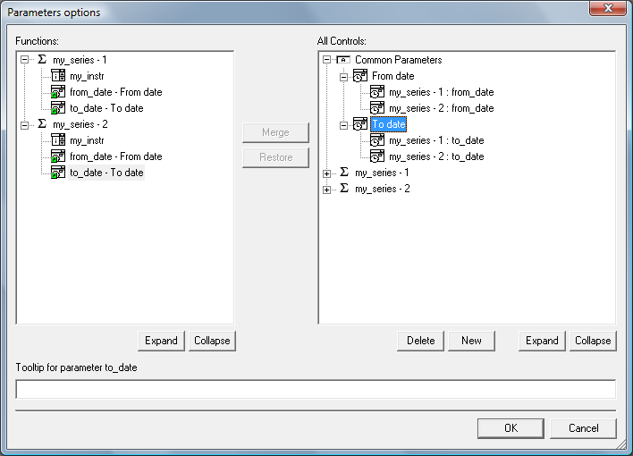
You find the dialog by right clicking on the canvas and choosing “Parameter options” or through the menu Graph | Parameter options.
On the left part of the dialog we find our functions with their parameters, on the right hand side all the auto-generated controls are shown. In the top of the right panel there is an empty group for common controls.
Start by choosing the first instance of the my_series function. The available parameters appear in the left list, if you click on the + sign to the left of the expression symbol \(\Sigma\) . Here we want to merge the date parameters from the two functions.
Grab the from_date parameter and drop it in the right hand list panel on the Common Parameters group. This creates a new common Date control and removes the corresponding auto-generated control further below. Give the common control a descriptive name, for example “From date”. In the same fashion, drag the to_date to the right and rename it.
In the function list on the left click the + sign to the left of the second instance of the function mySeries. This function’s parameters are now displayed below.
Drag-and-drop the second function’s fromDate and toDate on the corresponding common controls on the right.
You have now merged the date controls for this graph. If correctly done, it should look something like in the picture below.
So how does the graph look like now, having chosen some instruments and dates to display?
The common date controls now drive both my_series functions. “Today” is the key word used in a date control to always getting today’s date after you save and re-open a workspace. Setting today’s date also implies getting quotes in real time if connected to a real time source.
Tip
You can use the merge functionality in order to give the parameter control a user-defined label text, other than the function name that is the default. In this case you only merge one parameter to each control.
Now, we would like to have a more descriptive legend text than “my_series - 1”. Double-click at the graph to get the dialogue Attachment Options for Graph. Choose the Legend tab and delete the default legend text my_series - 1. Then double-click at the my_instr parameter to the right. It appears within {} signs.
Then do the same with my_series - 2. The effect is that the legend text will be dependant of the choice of instrument.
Of course, you can also type a constant string into the same dialogue, or combine strings with parameters.
Tip
It is possible to merge parameters on a separate canvas/window that will contain all graphs and tables’ parameters attached to a specific tab. This option can be found under View | Show tab parameters or by pressing Alt +5. For more on controlling an entire tab’s parameter space see section Tab parameters about “merging parameter in a tab”.
Using the graph mode toolbar
When a graph window is active the graph mode toolbar can be found under menu View | Graph mode or by pressing Alt + 5.
The buttons guide in which way the mouse interacts with the graph. By default, holding down the left mouse button over the graph will move the centre left and right.
Zoom in the graph by switching to the magnifying glass and creating an area to zoom in on by holding down the left mouse button.
Enable and disable zooming functions for the left and right y-axis by depressing the L and R button.
To display a value cursor in the graph, enable the line button |+. This will show y- and x-axis values in the legend box while you move the value cursor left and right in the graph. You can insert several value cursors by clicking this button repeatedly. To remove the value cursors, use the button marked with |-.
To insert a horizontal line use the button with the symbol -+ and to remove those lines use the button with the symbol --.
When changing any parameters used by the graph or when updates come from the real time feed an auto-zoom function is available. With the auto-zoom turned on it will refocus the graph on every update that changes position or size of the displayed graphics. It is possible to turn on the auto-zoom for each axis separately by pressing down the relevant axis button with double arrows.
Further auto-zoom features admit the user to always show the x-axis at the bottom of the graph rather than at zero, and always show zero level on the left and right y-axis when re-zooming. (The last three buttons on the lower row of the control these features.)
Continuing our example from An example of a time series graph and using the following formatting options …
Right click on the left axis to get the dialogue Graph properties and choose Multiply by 100 to the right in the Character pane. Also, choose 2 digits for decimal places and % as symbol. Press the Home button on the keyboard to get auto-scale.
Right click on the left axis to get the dialogue Graph properties and tilt the dates by choosing a 30 degrees slant.
Right click on the background of the graph window and choose Graph properties | Titles. Write appropriate titles for the graph and the axis. After pressing OK, the titles can be dragged and dropped at the ends of the axis.
Right click on the background of the graph window and choose Graph properties | Holiday and check that Hide weekends are clicked. Then you can also click at Sweden and Germany (for this example where we have a Swedish and a German bond) in order to hide all days that are holidays in any of the two countries.
…you will get a graph similar to this one:
Note
Any residual holes remaining in the graph, after proper holiday calendar(s) are chosen, are due to missing data in the historical database. Use your data cleansing tools to repair this missing data. See manual for the Database tool for help on finding missing data.
Graph formatting options
Right click on data series line (the graph) to:
Change the Order - by selecting a choice in the sub-menu you can change the order for how the graphs are displayed if you have attached several expressions to the same graph window. The legend text that corresponds to the last painted graph (in the front) is the last one in the legend text box.
Snap labels - see special chapter about creating labels (not valid for time series graphs)
Linear regression - to display a linear regression line for the time series
Copy - copy the underlying data from the selected graph making it available, for example, for an Excel spreadsheet.
Copy legend - copy the legend text
Properties - see table below
Properties detail
Functionality |
Description |
|
|---|---|---|
Legend |
Automatic legend showing current value of p arameters |
In the display name text box free legend text can be written. Any parameters used in the graph can be attached to the legend by double clicking on the parameter in parameters list. A parameter is inserted using {} brackets. Example: MyGraph showing {myInstr} from date {fromDate} to {toDate} |
Format |
Graph type |
Allows for line, column or points. |
Point type |
Options include plus (+), diamond (\(\diamond\)), circle (o), square (\(\square\)) filled or not filled. |
|
Color, font, width |
For vector of lines, a colour scheme can be set. |
|
Misc |
Right/left axis |
Choose to place the graph on the right or left y-axis |
Regression |
Change the colour and width of the regression line |
|
Optimise |
Will give a smoother appearance when zooming in and out. |
Right clicking in the graph space reveals:
Attach/Detach |
Attach and detach any expression from the graph |
|
Show/hide curves |
If many curves are attached to one graph it is possible to hide one or more curves temporarily without detaching them from the graph window. |
|
Graph properties |
Holiday |
To choose which holiday calendars that the graph should handle. If a market is chosen, the dates set as holidays will not show in the graph. Multiple choices are valid. Also weekends can be turned on/off. |
Titles |
To edit the main graph title, the y-axis and x-axis title. Font, size, and colour can also be set. |
|
Scale |
As default, the scaling is automatic and will follow the zooming. It is also possible to manually set the min and max scaling for each of the axis and also lock the scale. |
|
Misc |
To change the column width when displaying bar chart style. Changing font, size, and colour of the legend. Formatting the Value cursor(s) settings. |
|
Axis |
Change the date format, character display, line format for the chosen axis. Same dialog will show when double clicking directly on any axis (see description below). |
|
Parameter options |
Display the merge function dialog (see separate description) |
|
Minimal frames |
Will minimize the window frame of the graph (or table). |
|
Rename |
To rename the current graph |
|
Show/Hide parameters |
To show and hide the parameter canvas |
|
Duplicate |
Will create a copy of the whole graph including parameters and format settings. A reference to the copy will also appear in the workspace browser. |
Right- or double clicking on the right or left y-axis and x-axis:
Text angle |
Edit the slant of the text |
Font, size and colour |
Change font, size, and colour of the x or y-axis |
Line width |
Change the line thickness of the x or y-axis |
Symbol |
Place a symbol or other text behind the numbers (ex. ‘5.0 %’ or ‘5 Kr’) |
Date format |
Use default setting or format display using an interactive wizard |
Tip
By pressing the home button on your keyboard the graph will automatically fit and centre the graph. This feature can be set on automatic by pressing the buttons in the graph toolbar. Holding down the shift button and the left mouse button will zoom the graph when the mouse is moved.
Scatter graphs
For graphs where data don’t come in the form of a series the point function is useful. This function returns a point object, which consists of the x- and y-coordinate for a point in a graph. A vector of such object can be used for producing a scatter graph. For example, to plot a square function on some non-equidistant x-values you may use the following code:
out vector(point_number) my_scatter_graph()
{
   vector(number) x = [0, 0.5, 1, 2, 5, 10];

   vector(number) y = x^2;

   return point(x, y);
}
This function can be attached to a graph window and can then be formatted to show just the points or with lines in between, as described in Graph formatting options.
Plots using matrices or series(vector(number))
It is possible to plot a matrix of numbers or a matrix of points. Quantlab will interpret the matrix as a collection of column vectors that will be plotted as usual vectors.
Likewise, a series of vector of numbers will be interpreted as a collection of series which each will be plotted.
In order to distinguish between the columns in the matrix or the different series you can use the start and end colouring in the Properties dialog of the attached expression.
Similar plots can be created using a series with two range variables, see Series.
Column graphs
To produce graphs consisting of columns, mark the data series (the graph) and click the right mouse button. Select Properties and select the tab Format. Here you can select the graph type column and set the width of the columns.
Bar charts (hi-lo etc)
Often, financial data are displayed in the form of bars showing for example high-low or open-close prices. This can be done in Quantlab by using the pair object. It is simply a vector of two numbers that, when used in graphs, it is displayed as a bar starting at the first number and ending at the second. For instance, the following expressions can be used for creating a bar chart with bid and ask yields.
out number my_yield(instrument_name i_n, date d, quote_side q) = instrument(i_n, d, q).yield();

out series<date>(pair) my_high_low(instrument_name i_n, date from, date to)
{
   return series(d: from, to; pair(my_yield(i_n, d, 'bid'), my_yield(i_n, d, 'ask')));
}
If the second function is attached to a graph, it will show a typical bar chart which can be formatted with the desired bar width etc.
In the formatting dialog you can choose between line and column. In the first case the width will be constant, in the second case it will change when zooming in the graph window.
In order to show the dates on the grid it can be necessary to right click on the background of the graph and choose Graph Properties | Axis and un-click “When applicable display interval” in the X-axis format pane. Also, choose the tab Misc and click On grid.
To construct a chart with several values for each date, for instance open-close and high-low, you can simply attach several functions using pair objects. Of course, it can also be combined with a normal graph if the number of values is odd.
Pairs can also be combined with point objects. Then the second value in the point object will be a pair object.
Creating labels
A common case where the point function is used is when producing various kinds of yield curves. Then it is useful to show labels telling the names of the bonds. The following is an example of how to produce a yield curve graph with the instrument names.
out vector(point_date) yield_curve(curve_name c_n, date d)
{
   curve c = curve(c_n, d);

   vector(date) maturities = c.instruments().maturity();

   vector(number) yields = c.instruments().yield()*100;

   return point(maturities, yields);
}

out vector(label_date) yield_curve_labels(curve_name c_n, date d)
{
   curve c = curve(c_n, d);

   return label(c.instruments().maturity(), c.instruments().name());
}
First, attach the yield_curve function to a graph window and then the yield_curve_labels function. Then you get a question which function to associate this labels to. If you choose to attach it to the first function you will get a yield curve with labels connected to each point.
If the labels cover the graph you can drag and drop them where you want. To get them in the original position you can select the graph, right-click on the mouse and choose Snap labels.
Attention! In this example the curve is constructed twice for the sake of clarity. If there are frequent real time updates and many curves it may be necessary to store calculated data in global variables, see Local and global variables and Performance optimisation.
Example of a Danish yield curve with labels attached to each point.
Tip
If you only want the labels to appear when holding the curser over a point, you can select the graph, right-click on the mouse and choose Properties. Then go to the format tab and un-click Show in the Label box. All labels disappear but each label text will be shown in the yellow box that appears when holding the cursor on a point.
In the example above, the labels where attached to the graph function, another possibility that could be useful in some cases, for example bar charts, is to attach the labels to the x-axis. For example, given the following code
out my_graph() = [3, 5, 4]

out my_labels() = ['a','b','c']
you can produce labels on the x-axis by choosing that option when attaching the label function to the graph. If you want bar charts you select the graph and click the right mouse-button to get the Properties dialog. There you select Show attachment as Column. Note that in order to associate the labels to the x-axis, the graph function must consist of only a vector of number rather than a vector of points.
It might be necessary to zoom in or out in order to view the labels correctly.
Handling parameters
Simple parameter controls
Below follows a list of control choices that can be used for common controls where several parameters are merged into one control.
Control |
Used for common instances of: |
Example of Qlang code |
|---|---|---|
String edit |
String parameters (ex. ‘string’) |
|
Number edit |
Number parameters (ex. 12.4) |
|
Instrument control |
Instruments (ex. SGB1044) |
|
Curve list |
Curves (ex. EURGOVT) |
|
Date control |
Dates (ex. 2002-02-02) |
|
Day countlist |
Day count conventions (ex. ACT/360) |
|
Rate typelist |
Rate type basis (ex. effective) |
|
Quote sidelist |
Quote side choices (ex. Bid) |
|
Asset swaplist |
Asset swap calc types (ex. par_value) |
|
The instrument control
The instrument control leads to an extensive dialog identical to the one in DatabaseTool. The first element in the drop down list box is always the entry “Select instrument…” which gives access to the instrument dialog. In this dialog you have several possibilities for searching the instrument. You can also view more extended information about a particular instrument by clicking the Info button in the top right corner.
Tip
To find an instrument, write the beginning of the name in the index tab. The search function immediately goes to the first instrument that matches what you have written. To select the desired instrument, you can use the up and down arrows, and the press Enter.
All instruments that have been chosen are saved in the drop down list box.
Tip
After a while the number of entries in the drop down list box can be quite long. You can decrease it by pressing the delete button repeatedly, after having chosen an instrument in the list.
The curve control
The curve control resembles the instrument control as it is a list with one special entry (“Select curve type…”) giving the possibility to limit the number of curves in the list. Each curve in the database is of a user-defined curve type and in the dialog you can select a curve type that will be used in the list.
Creating common controls using Parameters Options
Common controls in graphs and tables can be used for input to several parameters by the use of merging in the Parameters Option dialog.
The dialog has to list panes, each showing the same information but in two different ways:
To the left there is a tree showing each attachment (instance of function) with its parameters as leaves.
To the right, there is a tree with groups of controls (common controls and auto-generated controls) with the controls as branches and all parameters associated to the controls as leaves.
See the example in section An example of how to merge parameters to common controls where the concept of merging is explained.
In the Parameters dialog it is also possible to set the order of common controls by using the right mouse button in the list to the right. The group of common controls is always above the attachment controls, however.
Tab parameters
It is common to organize multiple graphs and tables analysing similar things in the same Tab. Many times it is convenient to have common controls that guide all graphs and tables within the same tab. This can be achieved in the specific tab parameter window, which can be moved around and docked independently. The format of this window is specific to each tab.
To active the tab parameter window use View | Tab parameters, or Alt+5.
At first all parameter controls for every graph and table belonging to the tab will be listed in the window. It is now possible to merge desired controls into common ones. By right clicking on the tab parameter window and selecting parameter options, the merge dialog appears. (This is the same merge functionality available for a single graph or table, as explained in section Creating common controls using Parameters Options.)
In an example we wish to merge all curve controls and date controls into two common ones for the entire tab. Adding two common controls and dragging and dropping the individual function parameters into the common ones will give a workspace having overriding parameters in a separate window.
Example - upper left window - of common tab parameters overriding each individual window’s parameters.
Using the common tab parameter window it is possible to minimize the unnecessary space used by each window’s parameter canvas. This will also enable the user to use a single control to change settings for all analysis contained in a tab.
In the Parameters dialog it is also possible to set the order of controls and attachments. In the list of attachments to the left, click the right mouse button on an attachment and select move up or move down. To change the order of controls within an attachment, select the corresponding parameter and use the right mouse button. You can also change the order of common controls by using the right mouse button in the list to the right. The group of common controls is always above the attachment controls, however.
Note
It is advisable not to show tab parameters and specific parameters for the views at the same time, as the tab parameters override the specific parameters but not the other way round.
Writing tool tips for parameters
For each control it is possible to write a short help text, a tool tip, that will show up when the cursor is above the corresponding parameter. Open the Parameters Option dialog and select any parameter you want to describe, write the tool tip in the text box below, and click OK.
There are some exceptions to the tooltip possibility described above: Currently tooltips cannot be written for vector parameters that appear within a table. For some controls, such as a rate type list, Quantlab has its built-in tooltips that cannot be overridden.
User defined lists (fill functions)
In many cases it is useful to be able to create a user defined list. For example, you could define a list that gives the user various options for the calculations of a yield curve, or you could put limitations on how many instruments that should be shown in an instrument list.
We will describe this feature using two examples. In the first example, we will produce a completely new list. In this case you create a function that takes a string as input parameter which shows up as an edit box in the user interface. By attaching a function returning a vector of strings to this edit box you will create a list containing the elements in the vector. Here is the code:
out number calculations(string method)
{
   number answer;

   if(method == 'bootstrap')
   {
       // use bootstrap
       // answer = something;
   }
   else if(method == 'tanggaard')
   {
       // use Tanggaard's model
       // answer = something;
   }
   else
   {
       // use bootstrap
       // answer = something;
   }
   return answer;
}

out vector(string) method_list() = ['bootstrap', 'tanggaard'];
Now, proceed as follows:
First, attach the first function, called calculations, to a table.
Then drag the second function and drop it on the edit box that corresponds to the method parameter of the first function, as illustrated by the red arrow below.
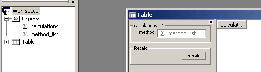
Drag the second function and drop it on the edit box as the red arrow indicates.
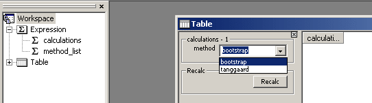
Having done this, and pressed Recalc, the text box is transformed to a list containing the two entries given by the vector, see the illustration below.
Our second example shows how to construct a list of instruments given a curve name. The first function calculates the yield of an instrument, given a curve fit.
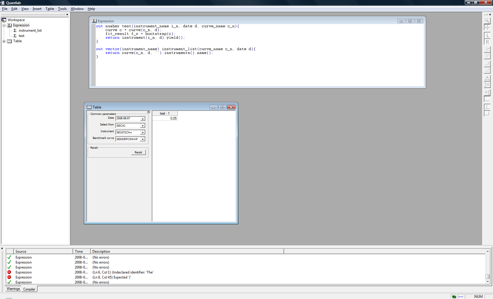
out number test(instrument_name i_n, date d, curve_name c_n)
{
   curve c = curve(c_n, d);

   fit_result f_r = bootstrap(c);

   return instrument(i_n, d).yield();
}
The second function gives a list of instrument names. (Note that we have set the quote side to an empty string, which will enforce the system to not look for a quote in the database or in the real-time source. We have done this, as we are only interested in the names of the instruments.)
out vector(instrument_name) instrument_list(curve_name c_n, date d)
{
    return curve(c_n, d, '').instruments().name();
}
Now, proceed as follows:
First, attach the first function, called test, to a table.
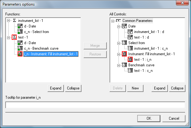
Then drag the second function and drop it on the instrument list that corresponds to the instrument _name parameter of the first function.
This will make the instrument list control of the first function dependent on the second function, i.e., the chosen curve. It may be necessary to use the Parameters option dialogue to put the controls in a natural order:
Fill functions cannot be removed using the Attach/Detach dialog. Instead, open the Parameters Options dialog and click the right mouse button on a control that has a fill attachment. A drop-down menu appears where you can select Remove fill attachment. Note that fill expressions can be attached both to auto-generated controls and common controls.
See also Zero coupon curve with blending and choice of methods: zero_curve2.qlw for further examples of using fill attachments.
Out-parameters in attached functions
If an attached function has parameters marked as out the treatment in the user interface corresponds to the treatment within the code. This means that you can set such a parameter in the function and the value will appear in the corresponding control in the user interface. This is particularly useful when initialising controls or when correcting erroneous input values. For example you could have a instrument table where the user is supposed to input a yield. To get an appropriate starting value you could use the market yield of the instruments. For example you could write the following code:
logical initiated = false;

out vector(instrument_name) names(vector(instrument) i) = i.name();

out vector(number) price_calc(out vector(number) yield_v, vector(instrument) i)
{
   if(!initiated)
   {
       yield_v = i.yield()*100;

       initiated = true;
   }
   return i.set_yield(yield_v/100).clean_price();
}
If you attach these two functions to an instrument table the yields will always be taken from the market when the workspace is opened but then determined by the user input in the table.
Note that, contrary to standard parameters, the values of out-parameters are not stored in the workspace when it is closed. The reason for this is that, typically, the purpose of the out-parameters is that you want to initiate the parameters by taking values from a distinct source, such as the real time data or the database.
See also Extending spread calculations with user input: bench_spreads2.qlw for further examples using out parameters.
Handling calculation order
General rules for calculation order of attachments
In some cases it is important to understand in which order Quantlab evaluates functions attached to graphs or tables to properly get correct results. This is especially true when using global variables and ensuring that they have been updated before proceeding with other calculations dependent on the global variable.
Ordinary function calls do not have a pre-defined calculation order. However, void functions receive special treatment in the evaluation engine. All void functions in a tab are evaluated first by the engine. This is also true for multiple expression windows (i.e. all void functions in all expression windows are evaluated before any other function is evaluated) in the same tab. However, there is no particular order among void functions, if several void functions are attached to the same graph, for example. Therefore, it is often best to use one void function and call the others.
Knowing that the void function evaluates first comes in handy when you need control over any global variables that need to be pre-processed. When this control should be extended to the user, in graphs and tables, the void function can simply be attached to the graph or table as any ordinary ‘out’ function.
An example;
number c; // the global variable availabe to all functions in the expression window

out void f1() // the 'out' keyword exposes the void function to the interface
{
   c = rng.gauss();
}

out number f2(number b)
{
    return b + c;
}

out number f3(number x)
{
    return x + c;
}
In the example above we assume that all three functions are attached to the same table. This will ensure that the global variable c always will be refreshed with a new random number before f2 and f3 are evaluated.
When there comes new input data to an attachment that currently is being evaluated (from the user interface or from the real time source), all this input data will be used in the next call of the function. This means that there is no queue of function calls of the same function attachment, so each attachment can only have three states:
Evaluation completed
Evaluation in progress
Waiting for evaluation, due to all new input data.
The two second cases can occur at the same time.
Often it can be useful to do some initialisations before all other calculations, i.e., on opening the workspace. This can be done using a global variable that is set by a function that does all initialisations:
logical init_all()
{
   // Initialization code
   return true;
}
logical g_init = init_all;
A special case in the evaluation order is that in an instrument table, the function calculating the instrument vector has to be evaluated first. This is because it is impossible to do any calculations at all before the vector is well-defined. See also Creating instrument tables using an instrument vector function and Calculation order in the instrument table.
Performance optimisation
An important application of the calculation order in combination with global variables is the case where you have a time-consuming calculation, for example involving time series data, and some faster calculations, for example involving real-time data, in the same graph or table. In such a case you could separate your calculations so the time series calculations do not involve any real-time data and put them in a void function that puts the result in one or several global variables. Then you can use ordinary functions to display the values of the global variables and combine them with real-time data. This will reduce the number of recalculations of the time consuming part to only the cases when it is necessary, i.e., when the user has changed any input variable and not each time there is a real-time update.
Note
In some cases it may be natural to attach a function that, given an instrument name as a parameter, retrieves data from a global variable. Then it should be noted that this function will not be updated in real time if it doesn’t also create an instrument. The real time engine is only triggered whenever an instrument (or a curve) is created using today’s date.
Calculation order in the instrument table
The Instrument table has a built-in initiation of the vector of instruments prior to the evaluation of both the void and ordinary functions. Any change in curve, quote side, or date will trigger a re-initiation of the vector, then evaluate any void functions, and last evaluate all ordinary functions.
This is also true for the case when the instrument vector is defined through a user-defined function as described in Creating instrument tables using an instrument vector function.